Elyra Canvas Components Overview
The Elyra Canvas package delivers two decoupled React objects: Common Canvas and Common Properties.

Common Canvas
Common Canvas displays a flow of data operations as nodes and links (edges) which the user can create and edit to get the flow they want. These visual flows of data operations are typically translated into data processing steps performed by the application. Common Canvas provides UI functionality for the visual display of flows in the browser and leaves persistence and execution of data flows to the application.
The common-canvas user can perform operations such as:
- Create a new node by dragging a node template from a palette onto the canvas.
- Delete a node by clicking a context menu option.
- Create a link by dragging a line from one node to another.
- Delete a link by clicking a context menu option.
- Add a comment to the canvas and draw a link from it to one or more nodes.
- Edit a comment.
- Move nodes and comments around in the canvas to get the desired arrangement.
- Create a new node by dragging a node from the OS desktop (or elsewhere on the browser page) onto the canvas. This takes a little bit of development work.
- And much more! …
Common Canvas Components
Common Canvas has several constituent parts that can be visible to the user and can be customized by the application:
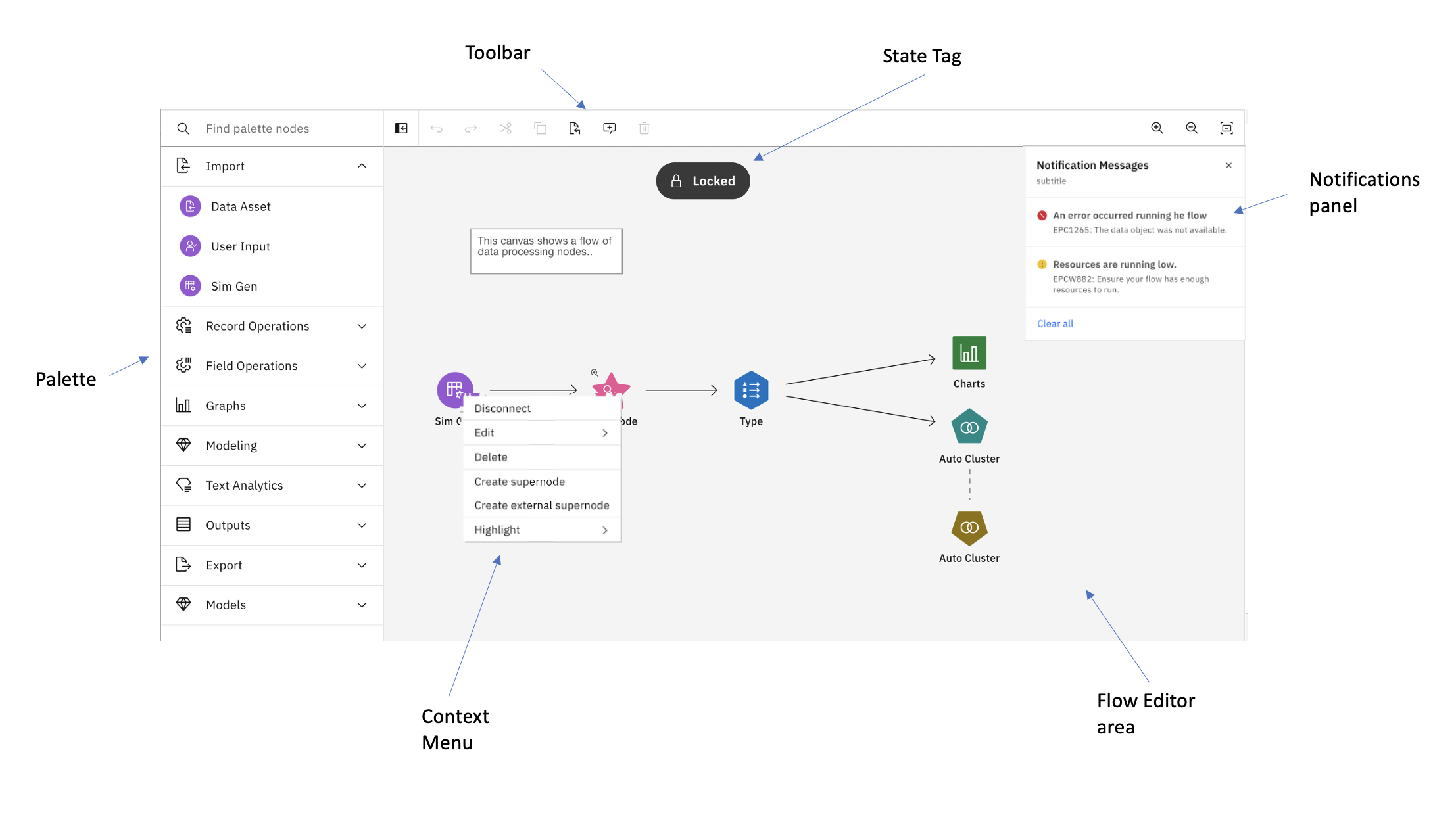
- Flow editor - the main area of the UI where the flow is displayed and edited.
- Palette - a set of node templates that can be dragged to the canvas to create new nodes
- Context menu - a menu of options for nodes, comments, etc.
- Context toolbar - a menu of options for nodes, comments, etc presented as a small toolbar
- Toolbar - a set of tools across the top of the UI.
- Notification panel - a panel for displaying runtime and other messages to the user.
- State Tag - a small pill-shaped component that appears over the canvas to indicate its state: locked or read-only.
- Tooltips - information tips displayed when the mouse cursor is over an object.
In addition, there are five optional panels where application specific output can be displayed such as
properties, log info or data previews.
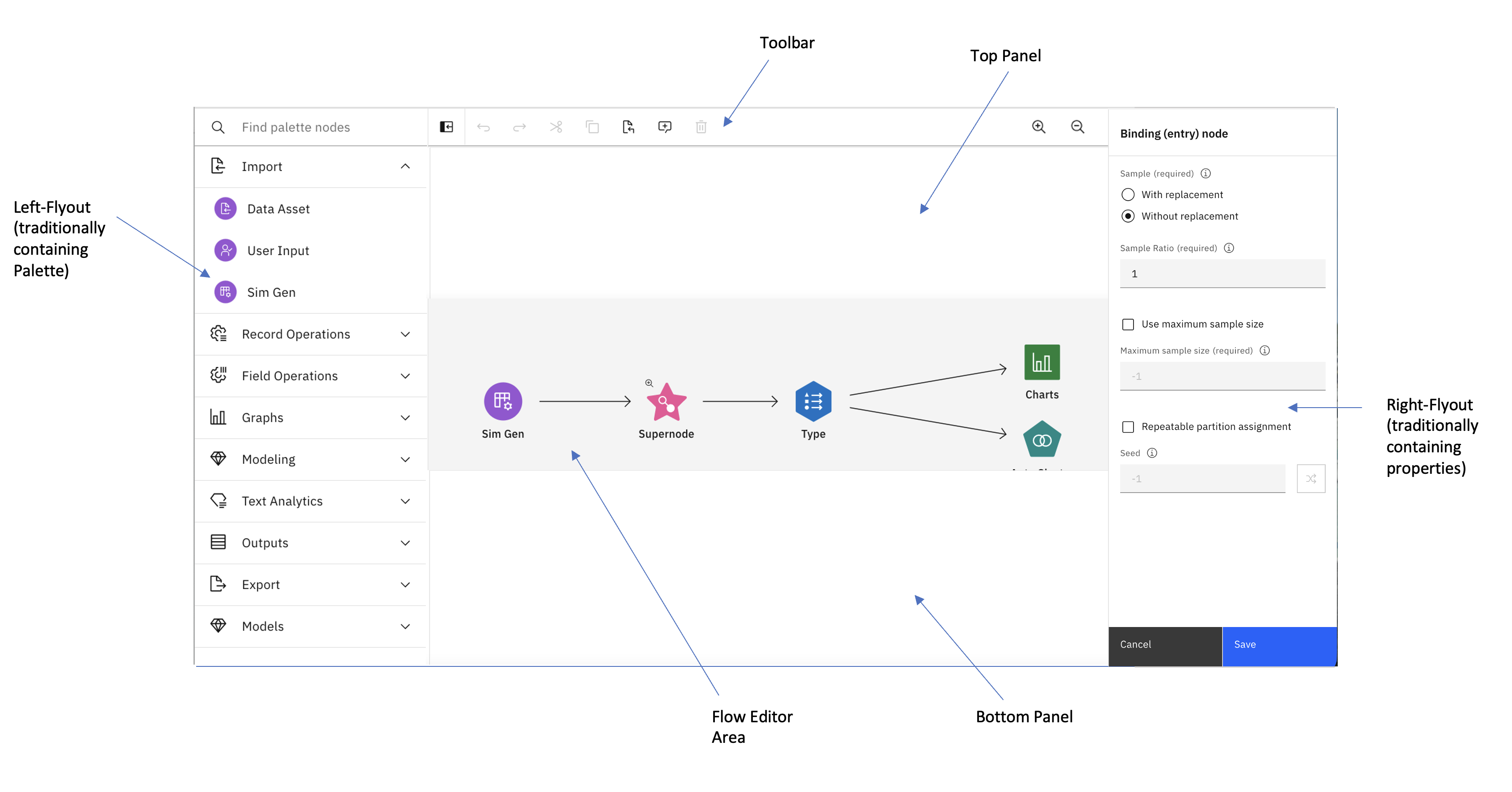
- Toolbar panel - always displays the toolbar but can be hidden
- Left-flyout panel - typically displays a palette of nodes
- Right-flyout panel - often used to display node properties
- Top panel - used to display other app related information
- Bottom panel - used to display other app related information
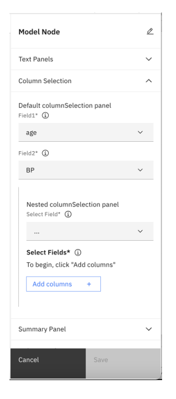
Common Properties
Common Properties allows the application to display a Carbon compliant properties panel or dialog with just a Javascript (JSON) object as input. Common Properties supports the most commonly used UI components and also allows custom components to be added into its visual output.