Panels Customization
Common Canvas provides six panels for display of different content. The Flow Editor panel is always displayed and, in addition, there are five optional panels that can be displayed or hidden by the application as required:
- Toolbar panel
- Left-flyout panel
- Right-flyout panel
- Top panel
- Bottom panel
Flow editor panel
This is the central area that displays the flow of nodes and links with optional comments. It is always displayed. The size of the flow editor panel is controlled by the presence and size of the other panels in the <CommonCanvas> area, mentioned below.
Toolbar panel
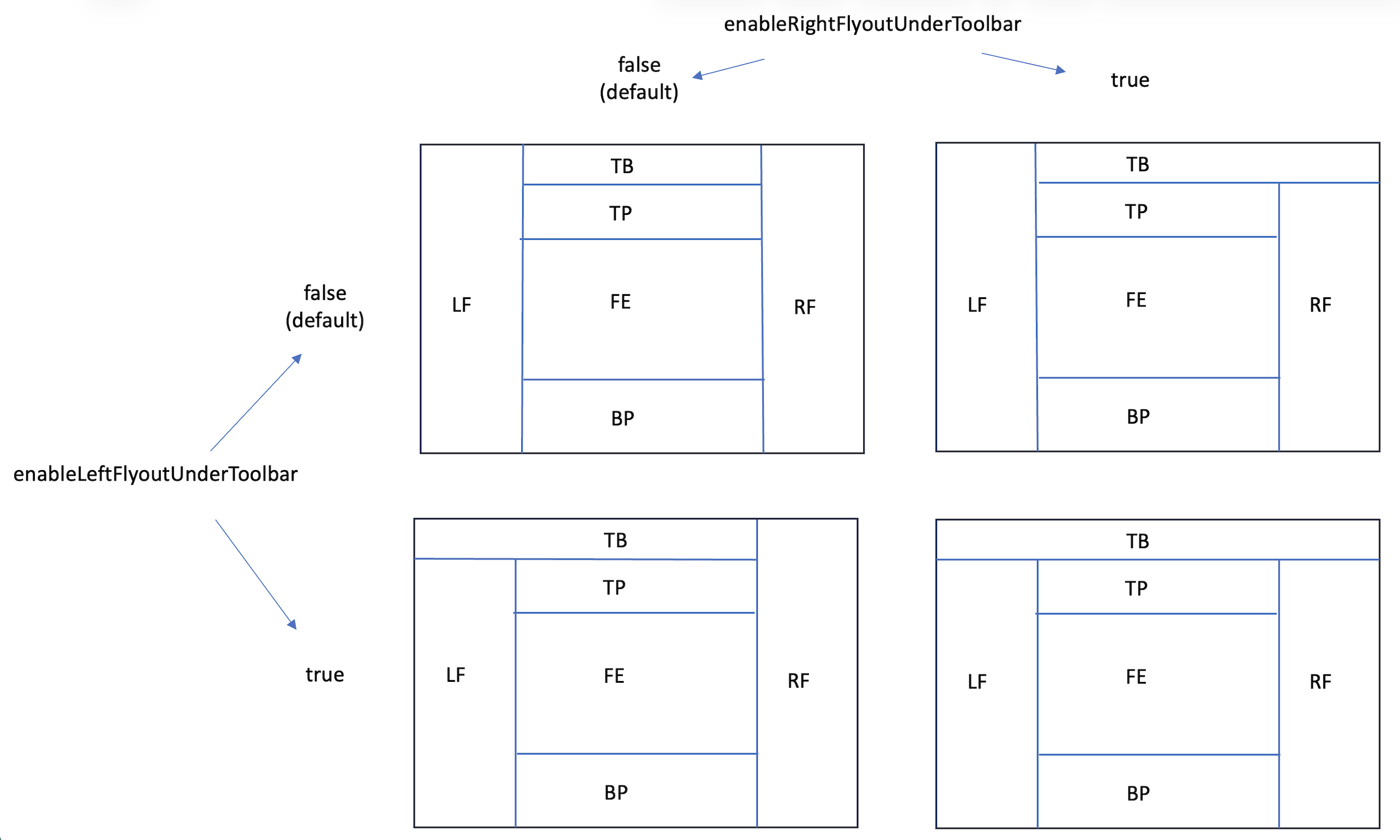
This is positioned at the top of the area that Common Canvas occupies, and only ever displays, the main toolbar.
It can be displayed by setting the enableToolbarLayout canvas config property to "Top" (the default) or hidden by setting the property to "None".
Its extent, relative to the left-flyout and right-flyout, is controlled by these two configuration properties:
Left-flyout panel
The left-flyout panel appears on the left of the Common Canvas area. You can add whatever content you like to this panel. Typically, it is used to display a palette of nodes which can be added to the flow in the flow editor.
Display of the left-flyout panel works somewhat differently to the other panels. If the canvas configuration property enablePaletteLayout is set to “Flyout” the display of the left-flyout panel is controlled by Common Canvas or can be controller by the application using canvas controller methods.
However, if enablePaletteLayout is set to “None” then these two optional props of <CommonCanvas> let the application manage the left-flyout panel:
-
showLeftFlyout: This can be true or false to indicate whether the flyout panel is shown or not. The default is false.
-
leftFlyoutContent: content to display in the left-flyout which is a JSX object. Nothing is displayed by default.
See the canvas controller documentation for methods to mange the left-flyout
Right-flyout panel
The right-flyout panel appears on the right of the Common Canvas area. You can add whatever content you like to this panel. Typically, it is used to display properties of nodes on the canvas. There are two optional props of <CommonCanvas> to let the application manage the right-flyout panel These are:
-
showRightFlyout: This can be true or false to indicate whether the flyout panel is shown or not. The default is false.
-
rightFlyoutContent: content to display in the right-flyout which is a JSX object. Nothing is displayed by default.
See the canvas controller documentation for methods to mange the right-flyout
Top panel
The top panel appears below the toolbar, above the flow editor panel and between the left-flyout and the right-flyout panel. You can add whatever content you like to this panel. There are two optional props of <CommonCanvas> to let the application manage the top panel. These are:
-
showTopPanel: This can be true or false to indicate whether the top panel is shown or not. The default is false.
-
topPanelContent: content to display in the top panel which is a JSX object. Nothing is displayed by default.
See the canvas controller documentation for methods to mange the top panel
Bottom panel
The bottom panel appears below the flow editor panel and between the left-flyout and the right-flyout panel. You can add whatever content you like to this panel. There are two optional props of <CommonCanvas> to let the application manage the bottom panel. These are:
-
showBottomPanel: This can be true or false to indicate whether the bottom panel is shown or not. The default is false.
-
bottomPanelContent: content to display in the bottom panel which is a JSX object. Nothing is displayed by default.
See the canvas controller documentation for methods to mange the bottom panel